Weatherby Healthcare · CHG Healthcare
Weatherby Healthcare
Eliminating the “Weatherby Tax” with a new component library and simpler UI that cut 30% of the code per page and lifted conversions.
- Client
- Weatherby Healthcare · CHG Healthcare
- Role
- UX Designer
- Focus
- Component library, Refresh
Introduction
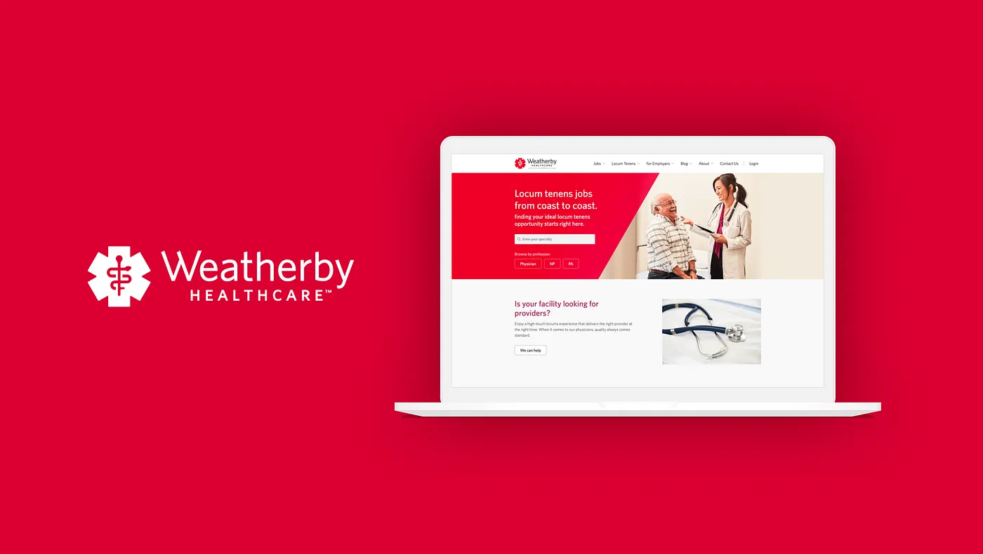
Weatherby Healthcare is one of the top locum tenens staffing agencies in the industry. Weatherby prides itself on its identity of professionalism, but over time the website experience started to become outdated and didn’t reflect that sense of identity. The original website used complicated visual elements that were built with the brand identity in mind, but not the user experience. On top of that, there wasn’t a firm component library in place. Over time, this lack of having a component library and using complicated visual elements became unsustainable.
The Weatherby Tax
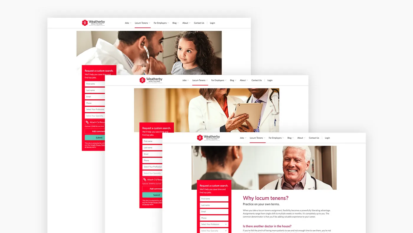
The Weatherby Healthcare site grappled with a poor user experience characterized by visually messy web components. Compounding this was the “Weatherby Tax,” a nickname highlighting the prolonged development time caused by the site’s intricate structure. Recognizing these impediments, our foremost objective in refreshing the Weatherby Healthcare site was not only to address the visual clutter and enhance the overall user experience but also to streamline and expedite the development process, mitigating the burdensome impact of the Weatherby Tax.
Goals
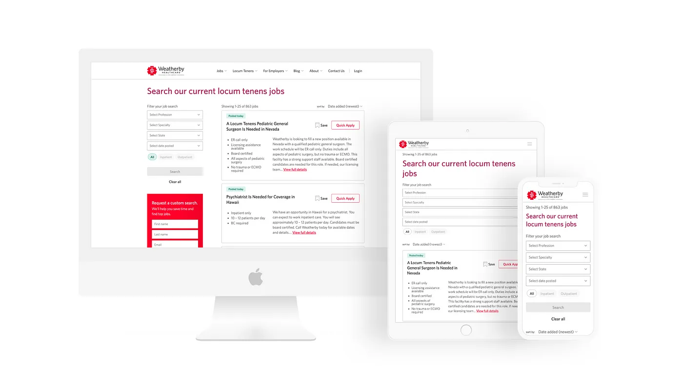
In this strategic update, our focus was refining the site’s visual elements and user interface rather than a complete rebrand. I played a key role in developing a new component library from scratch, prioritizing cohesive UI elements for enhanced usability. Simultaneously, we leveraged the opportunity to transition from Bootstrap 3 to Bootstrap 4, aligning with our continuous improvement efforts. Our goals included maintaining conversions, introducing the new component library, reducing code volume, enhancing user experience, upgrading to Bootstrap 4, emphasizing responsive design, and optimizing the UI for improved efficiency.
Style Guide & Component Library
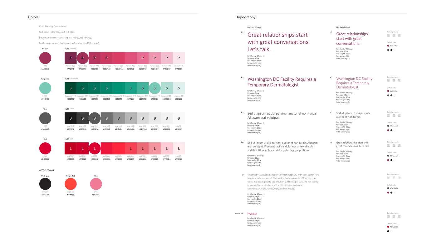
After establishing a cohesive visual language, the subsequent step involved the development of a new web style guide and component library. Collaborating closely with my development team, we engaged in iterative processes to construct the component library, serving as a foundational tool to uphold uniformity across diverse site elements. This encompassed key components like brand colors, typography, buttons, forms, pagination, as well as navigation and footer elements. The meticulous crafting of these components ensured a standardized and visually harmonious presentation throughout the website.
Results
An outstanding outcome of this project was the significant reduction in code volume achieved by the development team during the refresh. The implementation of the new component library and streamlined UI not only eradicated the notorious “Weatherby Tax” but also led to a remarkable 30% decrease in lines of code per page. This optimization not only enhanced the site’s performance but also contributed to a notable uptick in conversions, showcasing the tangible benefits of our strategic efforts to refine and improve the Weatherby Healthcare site.